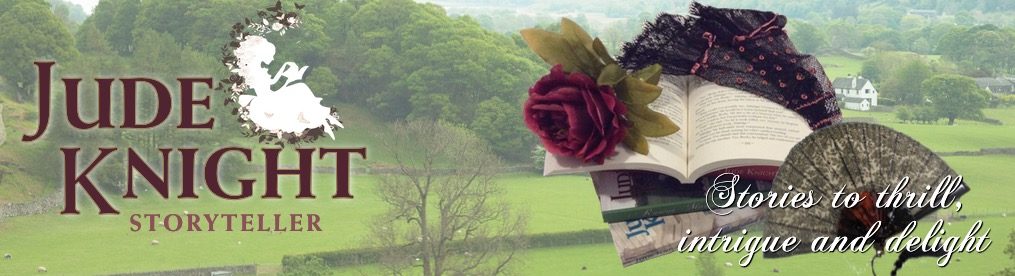


I sat on the commuter train with the designer this morning, and we did more work on one of these to make the words ‘pop’ a bit more. I’ll post that when I get it. Meanwhile, what do you think? Which colours and elements do you prefer, and why? UPDATE: I’ve just added the sixth one, where the words are a bit easier to read.
I like the banner in 1, but the picture in 2.
Rather echoing what others have said – I like the blue banner at the bottom because of the connection with the dress. However your name tends to get lost in the leaves in all of them, least so in #2 I think. I prefer the broad bottom banner style (#1, 3, 4) to the narrow one (2, 5) since the narrow edge seems a bit fussy to me.
Other than your name I therefore like #4 best, but would recommend you and your designer rethink the name bit.
We’ll definitely need to pull the name out more.
I like both of the top two, but I think I prefer the colors to left and the layout top right.
The second is my favorite. I like that the banner contrasts the dress and matches the color of your name.
I actually think your name gets lost in that blue-grey. I like the first one best.
I think it works better in the last two where the colours of the banner at the bottom echo the girl’s dress colour.